The definition of good reporting
•
As we saw in the previous article, reporting is one of the key elements of an efficient business strategy. This tool allows you to materialize data in order to measure the performance of your activity. You have probably also opted for reporting in your company. But are you adopting the important points to ensure that it is done well ? In this article, you will discover 3 tips that will make you a reporting pro !
Tip 1 : Choose the right KPIs / the right data in a report
Real decision-making tools, make sure to select your indicators carefully. And to select them, do not forget that they will be connected to the target audience ! To avoid the time-consuming aspect too often associated with the development of a report, anticipate, collect, and record information as you go along. The best way to access the most relevant and up-to-date data is still to rely on a solid technical foundation. By automating collection and analysis processes, a Business Intelligence tool can help you aggregate data to make it more readable and understandable quickly : it saves time and reduces problems.
Tip 2 : Use the right charts and dashboards to give meaning to your reporting
Once the relevant indicators are selected, a good part of the work is done. The format of the presentation is equally important. It is not always easy to choose the right illustration to express an indicator, but choosing the wrong chart can lead to certain misinterpretations. The first rule is simple : a chart represents a message. This is the moment when you can conduct tests; do not hesitate to share all your proposals with your colleagues to select the best option for a type of data. Good understanding also comes from thorough contextualization: comments, legends, suitable colors to highlight the essentials, etc. Give all the chances to your interlocutors to understand well the information you want to share. The choice of the right chart is significant, and there are several types available :
1. Show a relationship between multiple data
1.1 Bubble chart

Objective : allows to relate 3 indicators to illustrate correlations / Application : Bubble charts are usually used to compare and show relationships between labels and categories, through positioning and proportions.
1.2 Force directed graph
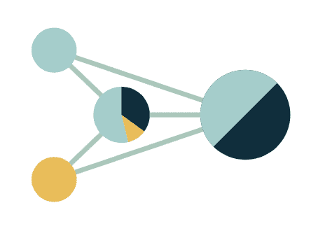
Objective : allows to relate 3 indicators to illustrate correlations / Application : Helps identify links between channels in terms of volume or flows, and allows pairwise comparisons.
1.3 Line chart
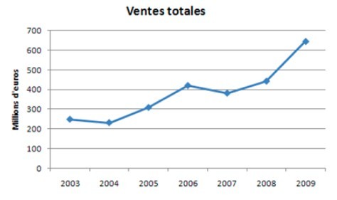
Line charts are perfect when it comes to displaying changes over time. They are compact, clear, and precise. The format of line charts is common and familiar to most people, making them simple to understand at a glance.
Objective : This chart offers the possibility to illustrate dozens of indicators that have (or little) direct relationships between them / Application : Use this chart to present data of different values and units.
2. Compare your data
Histogram chart
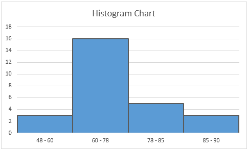
Objective : Classic comparison of volume or flows. The dimension can also be temporal. / Application : Use multiple indicators in the same group to compare your data. Keep it simple; do not compare more than 3 indicators at once.
Horizontal histogram chart

Objective : This data visualization allows comparing entities with each other, such as a company's performance against its competitor / Application : A horizontal histogram can be used when there are more than 10 labels to compare. This type of visualization can compare up to 3 different types of data. It is possible to combine information using composite charts. For example, a series in line and another in bars with mixed charts.
Tips: be cautious with overly sophisticated charts like 3D visualizations. Aesthetic as they may be, they lose effectiveness by complicating the reading of results.
3. Represent a proportion
Pie chart
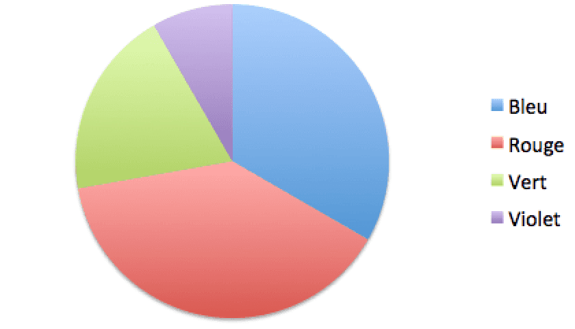
The pie chart is well suited for visualizing a % among a given set (also called a pie chart).
4. Represent a ratio
Gauge chart
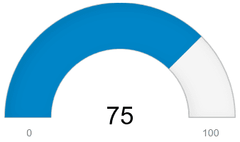
The pie chart can be used, but the gauge is more relevant, as it shows the positioning between 0% and 100%
Tip 3 : Make reporting available and understood by all
Be concise and synthetic by avoiding reporting that is too long and preferably choose an interactive solution! The idea is certainly not to overload your collaborators' minds with endless reporting. Get to the point! An interactive solution enables this simplicity. In one slide, it allows filtering the data. The information is therefore global and can be specified! Involve your entire team as this business tool requires data from various departments. It is a tool built collectively. Within it, we find data from HR, accounting, purchases. Thus, making all this little world work together is particularly effective. You will have understood for yourself that one of the challenges of reporting is the human factor ! We ask collaborators to participate in the production of data, so it is essential to provide them with feedback, adjust their actions, and congratulate them on their successes !
Ultimately, good reporting is also reporting that evolves! Your company may face both good and bad performance. Facing these fluctuations is imperative. Your indicators must be flexible, and it is necessary to know how to modify them at any time.
Some points to remember :
Good reporting :
Contains only essential indicators (it is concise)
Includes thoughtful KPIs
Accurately reflects the health of your activity
Is interactive
Allows communication about the work of collaborators
Evolves